Future Bens
About the client
Future Bens is an employee benefit platform that focuses on sustainability and eco-friendly consumption. Their mission is: “We want to connect people with products that are good for people and our planet.”.
They also aim to raise awareness about the importance of environmental protection and promote responsible practices such as switching to green energy, water treatment and waste reduction.
Project scope
They already have a website and the scope of this project is to design a mobile app that will help users browse comfortably. We sat together with the stakeholders and identified the app goals:
• to notify users about sustainable discounted products
• to help users access sustainable products
• to educate users on making more environmental conscious choices
• to increase sales
• to inform users about the impact of their choices
Device: mobile
Time: 9 days
My role
• Product Designer
• Survey construction
• Conduct user interviews
• Research analysis
• Wireframing
• Prototyping
• UI Design
• Testing
Team: 3 members (Pietro Colamussi,
Chris Croft and myself)
Methods & Tools: Lean Survey Canvas, Quantitative Survey and Qualitative Interview, Competitive Analysis, Empathy Map, Affinity Diagram, User Persona, Journey Map, Moscow Method, Branding, Moodboard, Style Tile, User Flow, Wireframing, Prototyping, User Testing,
Figma, Maze

1. Empathize
Research
Survey
For quantitative research, we developed a survey that was meant to help us have a better, clearer view on our users and their behaviour. The questions revolved around their interests and preference — for example price discounts versus sustainability — how often they shop and when they tend to do it.
We were interested in identifying whether they research and compare prices before purchasing, or if they are more spontaneous / impulsive.
After analysing the responses (38 participants), we discovered these key points:
Interviews
We followed up with 3 interviews — as a qualitative research method — where we gave our users the chance to open up and talk to us more in detail about their routines.
Here are the key findings:


Here is a look at the main pains of our users:
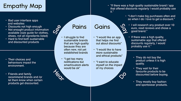
• “I struggle to find sustainable brands that are high quality because they are often new, not yet established brands”
• “I get too many notifications but smart/custom alerts would be ok”
We identified their needs:
• “I would like an app that helps me find out about discounts”
• “I would like to have more sustainable and ethical products”
Empathy map
We created an empathy map where we put all our key findings.
User persona
Based on this information, we imagined our user persona — Leonie Fischer. She is a 33 year old social media manager who lives in Berlin. She is familiar with the latest trends and styles, avoids fast fashion and prefers to invest in high quality products. She shops online often and looks for brands with attributes such as: environmental friendly, vegan, cruelty free, sustainable, recyclable, fair-trade, inclusive, bio.

Competitor analysis
Our next step was to analyse our competitors. We wanted to see our own strengths and pains.
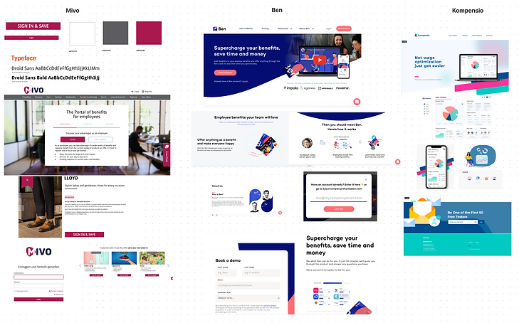
Why should users choose us? This is a very important question and looking at the other online employee benefit platforms helped us understand: What sets Future Bens apart from our competitors is the “sustainability” factor. While the other platforms also offer discounted products, they do not emphasise the impact of our choices on the environment. Future Bens offers an alternative for mindful consumption and supports users to have a more conscious overall experience.

User journey map
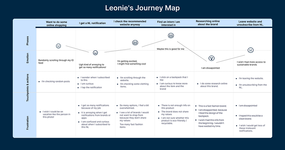
She doesn’t remember subscribing to the news-letter, but she is a bit curious — “Let’s see what this is about.”. She browses the website and sees a lot of fast fashion brands, whose values she does not share.
Finally, she finds a backpack from an unknown brand. She clicks on it and since the platform does not give her too much information, she decides to do her own research about the brand.
She gets disappointed when she finds out it is a fast fashion brand — “Too bad, I liked this design!”.
In the end, she is unsatisfied and decides to unsubscribe from the news-letter — “I’m disappointed by this experience and I wish I would not get any more irrelevant notifications!”.
2. Define
Problem statement
FutureBens was made to connect employees with sustainable brands and products. However, it does not meet their user’s needs of being available to them in a high quality and personalised mobile experience.
How might we?
How might we build an app that keeps our users informed and encourages them to shop sustainably without unnecessary notifications or difficult navigation?
Brand attributes and product goals
We identified our brands's values, because we wanted to make sure we will keep them in mind at all times, while designing the app.

We used the Moscow method to narrow down our list and eventually identify the must have features for our app.
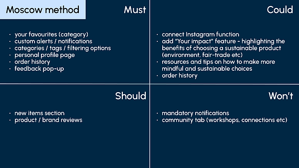
It is recommended for users to set their preferences so they can get personalised recommended content, to have the possibility to opt for notifications or against and also to favourite certain brands and add them to their wish-list. The user can decide if they want to make their wish-list public and share it with their team members. This would make it easier for all users to give and receive birthday gifts that they actually desire.
The stakeholder told us they would also like to connect more with the user and know if they are satisfied, so we included a feedback pop-up that allows the user to rate the platform and the app.
We also decided it is important to include a page where users can find out more about Future Bens’ mission and values and also where they can be more informed about the impact of their choices and shopping routines. We decided to also add tags for each brand to make the production process as transparent as possible.
User flow

We imagined our user flow.
3. Ideate
Lo-fi wireframes
We decided our user flow and then set an 8 minute timer to individually sketch the lo-fi wireframes for our app.
We continued by creating 2 different mid-fi prototypes and then voted for the one we liked best.

Moodboard
Before moving to the UI Design, we put together a moodboard that reflects our brand values and the visual direction we want to follow.
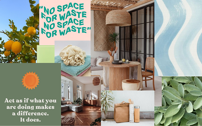
Branding and style tile

We created a style tile.
Design system

We divided the number of frames equally among team members and started working on the hi-fi prototype. Every morning we would have a stand-up call where we would share our progress and offer feedback. This was essential in order to make sure we are on the same page and that the UI of the app is visually consistent.
4. Prototype and test
Mid-fi prototype test results and findings
We tested our mid-fi prototype with Maze and analysed the feedback.
Out of 11 participants:
-
9.1% had direct success
-
36.4% had indirect success
-
54.4% gave up
The participants told us that some of the instructions were not clear enough and that they did not know how to proceed in certain situations.

Stakeholder feedback
We presented our project to the company stakeholder and got positive feedback! He was happy with our work and gave us the green-light to move forward.
Hi-fi protype
Test results
We tested our hi-fi prototype with Maze and had 13 participants. This time we had:
-
19.3% direct success
-
61.5% indirect success
-
19.2% gave up
-
80% of testers found the path to be clear or very clear
Next steps
Perform a contrast check for our app in order to make sure we respect the WCAG requirements.
Our goal for this sprint was to deliver an MPV and next we plan to reiterate based on the feedback from our testing sessions. We have a long process ahead of us that consists of testing — reiterating and then — testing again.
Another step is to add a “review” feature to collect comments from the users about the brands. This will raise engagement and offer extra info for the users who are interested in a certain product, while also making sure Future Bens is a transparent platform.
Finally, we are considering creating an extra section where we can provide additional information and resources to the users so they can become more sustainable and lead a more conscious life.
Takeaways and learnings
During this 9 day sprint, we learned about the importance of good time management. In order to deliver this MPV, we created a roadmap on the first day of the project and estimated the needed amount of time to complete each task.
Some processes need all team members to be present and involved, while other can be split up and delegated individually. Our daily morning stand-up meetings were key to make sure we are all updated with the process and can clear our uncertainties and offer feedback.
Keeping in touch with the stakeholder and regularly checking in was very important and helped us be consistent and make sure we are aligned with the brand values and identity.
We learned that we have to be very specific when offering directions for our Maze testers. Because the user-flow is so clear for us, sometimes we miss out on sharing important pointers that the users need in order to follow the desired path. We can refer to this as the proverbial — blind spot.
Finally, the main takeaway of this sprint is to always back up your choices with data! Each time our stakeholder had a question about one of our decisions — it was crucial to show him the data based on which we made that particular choice.
As a UX/UI Designer you have to practice empathy and constantly remind yourself that all your decisions must be made having the user’s needs in mind. This will prove to be a challenging task, as we are deeply subjective and opinionated creatures, but — for me — this is where the beauty lies!
